Post GGC! A bit late, but the whole team has been out cold since GGC ended. It was a great few days. We got so much positive feedback and tips for the future. Some players were even touched to tears. I don't think I've personally realized what I've had a part in making. People met us with such support and feelings. I feel very honored to be a part of Sigrids Änglar and hope I can contribute to our future. With that said; this isn't over!
Sunday, 29 May 2016
Sam & Nicole Final
Post GGC! A bit late, but the whole team has been out cold since GGC ended. It was a great few days. We got so much positive feedback and tips for the future. Some players were even touched to tears. I don't think I've personally realized what I've had a part in making. People met us with such support and feelings. I feel very honored to be a part of Sigrids Änglar and hope I can contribute to our future. With that said; this isn't over!
Friday, 20 May 2016
Sam & Nicole part 7
A little late. But here comes the trailer! One of the things I worked on last week. I put it together in adobe premiere CC while our producer Tova Svensson made the pictures. This week is the week before GGC and I've mostly just helped to put code together. Next week I'll make a post about GGC at it will be my final post. Thanks!
Tuesday, 10 May 2016
Sam & Nicole part 6
Last week was once again a week of working on both this and that. I can start with sharing probably our final background, Kungsträdgården. Beta is closing in on us and we have decided we won't hav time to implement more functional areas to visit in the game. So here it is!
I've started editing the trailer as well. It will be available at this blog and our facebook page next week.
Other than writing dialogue into xml files I've started painting a background with Nicole. It's going to be used on Sam's phone which is the game's menu. Here is a picture of the process, transferring the digital sketch to paper! That's all for this week!
I've started editing the trailer as well. It will be available at this blog and our facebook page next week.
Other than writing dialogue into xml files I've started painting a background with Nicole. It's going to be used on Sam's phone which is the game's menu. Here is a picture of the process, transferring the digital sketch to paper! That's all for this week!
Tuesday, 3 May 2016
Sam & Nicole part 5
Last week I didn't do much of background art. I mostly helped out writing events in xml to help finish up before alpha. So there isn't much to tell. The first prio backgrounds is done. But I actually re-painted the living room.
Since we had the time we took this opportunity since the living room didn't match up with the other backgrounds. And thats all for this week!
![]() |
| Before |
![]() |
| After |
Friday, 22 April 2016
Sam & Nicole Part 4
This week we have had our ups and downs. Yet, I've finished the first-prio backgrounds! The living room, medborgarplatsen + café + club, and school corridor. Since we are still rather early in production we used this free time by the end of the week for me to re-draw the living room to match the style of my other paintings.
Other than that I've been working with color matching the backgrounds sharing the same accent colors. Like medborgarplatsen, the café and the club. I posted an image of the café last week, and I'll show that one compared to the new one and the other backgrounds.
![]() |
| Before |
![]() |
| After |
The café might need a bit more tweaking, but for now it'll do. See you next week!
Friday, 15 April 2016
Sam & Nicole Part 3
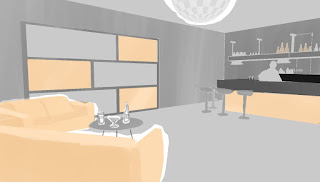
Production continued where it left off in the previous week. I've painted four of the backgrounds and cleaned them on the computer. Here is the café~
The colors aren't final yet. I'll continue to tweak them when we can compare them to in game characters and dialog box which isn't done yet.
As I explained in the previous post parts of the background is painted separately to make it possible to slide them onto the "stage"(background) when it is being loaded. The originals looks like this~
The colors aren't final yet. I'll continue to tweak them when we can compare them to in game characters and dialog box which isn't done yet.
As I explained in the previous post parts of the background is painted separately to make it possible to slide them onto the "stage"(background) when it is being loaded. The originals looks like this~
That is how they are used in the engine.
The difficult part of this week has been to match my painting technique. I haven't been using watercolors for a little while and I had to experiment to come up with the visual technique I wanted to use while painting. Unfortunately I did not do a test run for this, instead I went straight to production work. It caused the style of my first painting to be different from the others. Thankfully I was able to tweak it digitally to look more similar to my later painting. Here is an before and after of the living room~
![]() |
| Before |
![]() |
| After |
It isn't perfect but it will have to do for now. If we get time at the end we decided I could repaint it.
That's it for now!
Friday, 8 April 2016
Sam & Nicole part 2
Week two of the course have been are first actual work week.
One of the things I did this week I've made digital prototypes of the four background images we have decided to be our first prio to have a functional game.
First I built up a base for the environment in Google sketch up and then imported a 2D image of it and painted on top of it. I did this to help decide on the colors and the shading. I did this because it is much easier to change and manipulate a digital image than a traditional one.


Above is the prototypes we decided on. Another thing we decided on was that some of the objects in the backgrounds is painted separately. An example is the lamp, potted plant and the coffee table in the living room (Image with the blue sofa.) When painted separately these objects can be animated to a certain degree. What we have in min is when you arrive at a location the base background appears. then the other objects sweep in from the sides. Kind of to mimic old school theater coulisses or assets. Why we want to do this is because we want to bring a little bit more life to the back round instead of just having static images.
About the colors. We decided that a specific area has their own accent color to help the player remember where the places were and where they met certain characters as their clothes will share the same accent color.
In the examples I have only the club and the café share accent colors. That is because orange is "Medborgarplatsen"'s accent color, so all the places in that area has orange accent. In the same way with the school. The corridor is yellow, the classroom would be yellow etc, and the characters appearing there will have yellow accent on their clothes.
Thats the sneakpeak for this week!
One of the things I did this week I've made digital prototypes of the four background images we have decided to be our first prio to have a functional game.
First I built up a base for the environment in Google sketch up and then imported a 2D image of it and painted on top of it. I did this to help decide on the colors and the shading. I did this because it is much easier to change and manipulate a digital image than a traditional one.


Above is the prototypes we decided on. Another thing we decided on was that some of the objects in the backgrounds is painted separately. An example is the lamp, potted plant and the coffee table in the living room (Image with the blue sofa.) When painted separately these objects can be animated to a certain degree. What we have in min is when you arrive at a location the base background appears. then the other objects sweep in from the sides. Kind of to mimic old school theater coulisses or assets. Why we want to do this is because we want to bring a little bit more life to the back round instead of just having static images.
About the colors. We decided that a specific area has their own accent color to help the player remember where the places were and where they met certain characters as their clothes will share the same accent color.
In the examples I have only the club and the café share accent colors. That is because orange is "Medborgarplatsen"'s accent color, so all the places in that area has orange accent. In the same way with the school. The corridor is yellow, the classroom would be yellow etc, and the characters appearing there will have yellow accent on their clothes.
Thats the sneakpeak for this week!
Thursday, 7 April 2016
Sam & Nicole Part 1
For the Big game Course at Campus Gotland I'm going to work for Sigrid's Änglar to develop a Datingsim/RPG game called "Sam & Nicole" created by Sigrid Svederoth.
Sam & Nicole is a Datingsim/RPG game that educates people about gay youth. You play as a girl who have fallen in love with another girl. As the player you control Sam and get to choose how she is reacting to different situations and problems that occurs when you come out as gay. How you handle certain situations, and how strong bonds you have with other character affects the course of the game.
My role in the team is background artist. The backgrounds is going to be painted in gray scale watercolors with a few accent pastel colors. Parts of the background is to be painted separately to add some moving elements in the background to make it more interesting since it is a 2D only game.
Here is a mock-up of a in game screenshot!
Wednesday, 28 October 2015
Final 3D1 Assignment part 1
Back again, and now I'm going to make a short introduction of the current assignment. We are modelling characters, and I'm modelling this quirky creature created by Charlie Eliasson.
Her name is Askanderiya. A former librarian of library of Alexandria.
I'm sadly going to be brief about this too, since I finished the model a week ago or so.
Coming to the texture I can tell you that I had a real fight with the UV map. Errors started to show up here and there. Planes disappearing and edges that didn't want to disappear even if they were all surrounded by planes etc. I fought with this and managed to get all the parts except the face as a finished UV. Though, the day after it hadn't seemed to be saved, plus planes had disappeared again. So I decided to solve that problem once and for all. I managed to solve this by exporting the model as an obj, import it and mend it, and then export it and import it AGAIN. Then, finally, it all acted as it should. And after a few hours, and intense manual tweaking and fiddling I created the UV. It was tedious but I kinda enjoyed it anyway oddly enough. Most of all I'm proud over that I actually managed to get all the parts so tightly together. For assignment 2 I actually forgot to think about how the parts was placed on the UV. I just let the software do it for me and didn't think much of it. This time I only used the software to give me something to begin with. Then a session of puzzle pieces meets Tetris! I might have gained a understanding why people likes Tetris. It is so satisfying when everything fits together.
Now off to painting the texture~! Been looking forward to this since Charlie showed me Askanderiya!
Her name is Askanderiya. A former librarian of library of Alexandria.
I'm sadly going to be brief about this too, since I finished the model a week ago or so.
This is the model so far. The model itself is finished, and I finished the UV map today. Our budget for this model was 3 000 tris (+10% due to details). Because of this I had to cut down on some of her details. She got lots of rings, bracelets and other jewelry I just couldn't include on the model. Along with that she is also missing her belt and the scrolls. I thought the kitty backpack was more important to her character and silhouette so I decided to prioritize it. But, as for the jewelry I'm going to include it as much as possible on the texture.
Coming to the texture I can tell you that I had a real fight with the UV map. Errors started to show up here and there. Planes disappearing and edges that didn't want to disappear even if they were all surrounded by planes etc. I fought with this and managed to get all the parts except the face as a finished UV. Though, the day after it hadn't seemed to be saved, plus planes had disappeared again. So I decided to solve that problem once and for all. I managed to solve this by exporting the model as an obj, import it and mend it, and then export it and import it AGAIN. Then, finally, it all acted as it should. And after a few hours, and intense manual tweaking and fiddling I created the UV. It was tedious but I kinda enjoyed it anyway oddly enough. Most of all I'm proud over that I actually managed to get all the parts so tightly together. For assignment 2 I actually forgot to think about how the parts was placed on the UV. I just let the software do it for me and didn't think much of it. This time I only used the software to give me something to begin with. Then a session of puzzle pieces meets Tetris! I might have gained a understanding why people likes Tetris. It is so satisfying when everything fits together.
Now off to painting the texture~! Been looking forward to this since Charlie showed me Askanderiya!
Year 2
Long time no writing. I have neglected this blog a great deal. I'm bad at blogging. In short. Anyhow. It is my second year at Campus Gotland now, and I've finally started with what brought me to Gotland. The 3D course! I've been looking forward to this moment a lot. I've loved every minute so far, even the ones when I'm having so many software issues and errors I don't even know how to describe.
Now, we are actually at the end of this specific course. This course consisted of three assignments being done individually. The first assignment was to create two kinds of crates. No texture. The second one was to model a object from real life using photo textures. This one was going to have diffuse map, specular map, roughness map, and normal map. I found this especially fun as this brought the model to life.
Here is a reference of the object I choose.
And here is my finished model.
It is a bit different, yes. I had to cut down on the details. But I learned a lot from experimenting with the combined effect of the specular map and roughness map in the unreal engine. I don't have much to say since this was a couple of weeks ago. I'll talk about our final assignment in my next post!
Thursday, 19 March 2015
Night of the Piñata Week 9
Week 9, one week left until final week. Time moves fast
when having fun, or just drowning in work. This is the last mandatory blog post
I need to make about this project. There are a possibility that this will
indeed be the last, but I might write a post about the finished game just to
show how our efforts paid off.
One of my final tasks on this project was to animate the
parade that is going to be in the game. To make the children and the adults
correlate to each other we decided that the one that drew the children also
should draw the adults. Though, the children was animated frame by frame in
photoshop, and we simply didn’t have time to make an animation that way. So, it
was decided Matilda, who drew the children, drew the adults and I animated them
in flash.
Matilda drew all the parts independently, as I explained
in an earlier blog that all parts for a bone animation must be able to move
around without leaving empty spaces behind them. I then imported the parts into
flash and made a bone skeleton to each adult in the parade. Then I started
animating.
I discovered the challenge with animating multiple walk
cycles in one animation is to make them all loop together. All the cycles need
to be of equal length, otherwise the one with a shorter walk cycle will stop
until the longer cycles end. So I needed to work in an equal length for all of
them, but still make them seem rather differently so they don’t all move their
feet at the same time. It is a flock of folks having fun, not military trained
cadets.
Anyhow, the process moved on rather quick after I got a
hang of it, and I managed to animate six people within just a few hours. A
process which would have taken lots of hours if animated frame-by frame. It
doesn’t become as alive as the animation of the children, but there is a give
or take in this situation.
As the final week of our project is next week we are
pretty much finished. Most of the art that is needed to the game is done, it is
just some coding left to be worked on. This project has been highly demanding,
and it almost surprise me how well we have done. See you in the future perhaps!
Thursday, 12 March 2015
Night of the Piñata Week 8
Greetings once again! Yes, the name of our project game
has been changed from “Day of the Piñata” as the original concept called it to “Night
of the Piñata”. The reason was that the only level we are going to be able to
finish for the game will be at night. It is logic like that!
This week, aside from putting together sprite sheets and text
documents, I have been working on a confetti effect for our game. We decided,
that confetti will be used to indicate special events and effects in our game.
For example, when the score meter reach the point when a power up will spawn
confetti will pop around it. As well as when the piñata shrink or grow. Even
when the piñata shoot candy there will be a small confetti burst by its head.
It will simply be there to give feed-back to the player.
I worked on the most general confetti burst, using flash
once again. As I did before I animate high-resolute photoshop images in flash.
For this I used motion tween which make is ridiculously fast to animate. But
that do not mean its easy. My first try looked like this:
I was not happy with the result at all. I wanted a burst of confetti. It turned out to be something more of a tornado of confetti. The pieces swish around as if they were thrown by several different wind directions. The reason for this was that I curved every line they followed, and didn’t have a solid plan for their movement what so ever. So I decided to start again. This is how it turned.
It will be moving slightly faster in the game. This time
I focused on the confetti pieces, thinking about where they should end up if
they all start somewhat at the same point and then was forced away from each
other all at once. They ought to move in a straight line from the same point,
creating a circle around the center. This made the confetti much less messy,
but I am afraid it got too uneasy and too coordinated. I am thinking about redo
this effect, one more time. But as it seem now with our schedule I will leave
it as it is for now. It is not of the highest priority as this time. That is
why I will leave it at this stage.
Beta here we come!
Thursday, 5 March 2015
Day of the Piñata Week 7
Greetings once again! Week 7 of our 10 week project is
soon to an end and I have started to see the light in the end of the tunnel. We
can see the end of this project. This week I am going to explain my
unnecessarily problematic procedure in creating sprite sheets.
I’ll use the medium piñata’s walkcycle.
The issue is that every frame is 1952x1306 pixels which are
far too huge. The reason why they were animated in such a big size was that
when animating with non-vector images in flash, you lose quality when you
rotate them. I have an example below.
In the second picture notice how jagged in the edges the
image gets. It is because when importing images to flash they get converted to
bitmaps. Flash is primarily made to animate in vector graphics which can resize
and rotate in any manner without losing pixels, which bitmaps can’t. Why I did
not use vector graphics in flash was because we could not achieve our game’s
somewhat painted look with flash’s tools.
Anyhow, to solve the information loss issue I simply
covered it up. I animated huge images. Exported each frame as a PNG without resizing
them. Imported them into the same file in Photoshop and there resized them to
the accurate size. Viewing every frame at once I cut off left over space as
well. (I did this when viewing all the animations for the medium Piñata in the
same file to avoid frames being centered incorrectly in comparison to other
animations.) By doing that the information loss in the images gets so small
they can’t be noticed. Then that problem is solved!
Next issue was that they needed color correction. In the
beginning we hadn’t completely decided on the hue of the colors in the game,
and I needed to start animating right away. So I did that, deciding I could
correct them later, and so I did.
After I exported all the resized frames out of photoshop
I used “Glue it” to create them into a sprite sheet. Then I opened it in
photoshop and simply put a cut out from our game’s background underneath and
from there I adjusted the hue of the piñata until it fitted together with the
background and other assets. What I did was to add a blue photo filter, and
after that I opened color balance and added more yellow to the high lights. I
repeated the exact same procedure for all the sprite sheets to make their
colors identical.
Here you can see before (left) and after (right).
Left is far more saturated in the colors compared to the
background, and they are too little blue. Right is more calm in the colors,
sticking out less making it more part of the world it is placed in. It seem
more to be in the same light as the background.
And there we have it. A slightly complicated ride, though
necessary. I would have liked to show an animation of the finished sprite but I
don’t possess that at this moment. How to make a sprite sheet into a gif that
is. See you next week!
Wednesday, 25 February 2015
Day of the Piñata Week 6
Yet again another week on our Project of Day of the Piñata. We are moving steadily forward to an unknown future. This week I am working on the Piñata’s melee attack animation as well as their idle animations. What I will present to you is the Large piñata’s idle animation. Here it is in a poor quality gif!
The large Piñata differ from the small Piñata in color and design. It is because in our team we decided that we wanted that the largest piñata were going to have a bigger impact. It is bigger, it can destroy larger objects, it is more threatening! It’s appearance should communicate that as well. That is why the large piñata is a bull, because it is associated to be dangerous and trample things in it’s way. Bulls are typically associated with mexico as well as our game is taking place in. Moving on, the bull piñata was given sharp horns jutting forward making it dangerous for anyone in front of it. Overall it has more carper edges than the previous piñatas. And it has glowing eyes to illustrate that the evil spirit possessing the piñata is at it’s strongest.
Even when standing still I wanted the piñata to be threatening. A bull threatening to charge. Yet, I am limited to just be able to move certain parts of the piñata without bending them. It is the huge drawback of animating on a rig. So I did what I could.
Still working with animating with a rig in flash I made the middle folds of the piñata to move as if it was breathing. I added movement to the tail tassel and the trim to increase the “life” of the piñata since stretch and squash can’t be used in this. The head is moving up and down giving slight movement to the tassels on the sides of its head to increase the illusion of breathing. It made the piñata look rather alive and active, but it needed something more. In the group we have already early discussed the large piñata’s aesthetics, and making it have a flame-like inside illustrating the angry spirit within. So embers was added coming out of it’s nostrils when exhaling. It was made very simple in flash using motion tween. I made the ember glows follow a curvy line, growing and shrinking in size.
So there we have it. The idle animation of the Large Piñata.
Wednesday, 18 February 2015
Day of the Piñata Week 5
For this
week I have started working on the animations for the Piñata. I decided to
learn how to animate in flash with the bone tool to be able to produce
animations faster as we will need three different animations for each action of
the player character. How I thought the piñata would move proves to be perfect
to this method as well. The Piñata is made of paper hence can’t stretch or morph
much as it would break. The loss of animating with the bone tool is that you
can either get no stretch or distorted stretches as you stretch the image
itself. Therefor this technique is perfect when I don’t want to do any of that!
Starting
with, when you are going to build a skeleton for 2D images you need to have
every piece by itself. I want to be able to move the head of the Piñata without
having a plank space being left behind it in its front part and neck. So I drew
every piece as whole. Like this:
It is like
a paper doll, which is appropriate since Piñatas are paper made!
Next I had
to import my parts into flash. I had big troubles with this because my images
either lost quality or became distorted. My solution to that was to have a PSD
with all the parts in separate layers. Then I imported one layer at a time from
that PSD as a movie clip. If I did not follow this process the layers got
confused with each other and got dirty with pixels from other layers.
The next
step was simply to link all the pieces together with the bone tool to create a
piñata skeleton. When done it was only to get animating. The skeleton makes it
able to drag and move the pieces related to each other at once. It can’t be controlled
to 100% so I had to go in and rotate and move some parts individually in the
essential frames. Still it is a much faster process than moving each part
individually for each frame. You just make a new frame and move the skeleton
and adjust the parts to your liking, and the program does the rest. It is like
a motion tween but much more manipulation friendly. Here is an image of the
skeleton and how it keeps all the parts in place when moving them around.
I would say
that this method is very cheap, and it is difficult to get life into the
animation since there is a loss of squash and stretch which is one of the
twelve elements of animation. Yet, it is helpful and fast, and rather realistic
to the material as of this case.
Here is a
preview of the small piñata’s walkcycle. It needs polishing, but it is a start!
See you next week!
Thursday, 12 February 2015
Day of the Piñata Week 4
A new year, a ned course, a new project.
Game development is our new course and we are developing a game, from concept to finished product over a ten weeks time. We are in our fourth week in developing “the Day of the Piñata”. The concept for the game is to play a Piñata who got possessed by a vengeful spirit on the day of the dead in mexico. The Piñata want revenge for all of the poor piñatas who get masaccred just because of their sweet insides. So the mission of the players is to play the Piñata and wreck the festival and save a Piñata in the end of the level.
My job in this project is so far mostly on the player character, the Piñata. In the game the Piñata can gather candy, and depending on how much candy it has it have different sizes. There are three of those. Small, medium, and large. To get smaller the player can shoot candy as projectiles. I worked on all three this week, but I’m only going to talk about the small one for now.
We had many different ideas for the Piñata, and here are some of them.
Nr 1 and 2 was the first idéas when following the original concept idea of a rather cute Piñata. Round shapes and not much detail. Yet each size didn’t speak much of its abilities. Like, the bigger you get the bigger objects you can destroy. You get more dangerous, that should have a visual difference. Also the idéa of the game was going to be a bit darker than the original concept. How we were going to animate the Piñata was the reason of the take of nr 3 and 4. Piñatas are made of paper, hence they would not be able to move their limbs much, or they would rip. Thats why we I cut the Piñata in half and added folds, like with a accordion or paper lantern. It would make the Piñata able to move in a realistic way related to its material.
My favorite of these was nr 3, yet it was too extreme and not the feeling I wanted for the small Piñata. The smallest one was going to be the most “friendly” and normal, and then the bigger it gets the more extreme it gets. So it was made into nr 4. Its accordion spine much smaller and shorter that also makes the Piñata look emptier, since this is the form of the Piñata with the least candy.
When the design was done I made the lineart in photoshop, pretty thick to make the Piñata easier to distinguish from the background. Then colored and shaded. The colors was hard to decide. We ended up with purple, pink and green as the contrast color. The idea is that the color will change slightly by each size, getting darker. Green was decided because of its positive association. Like stop light. Green means go. That’s why the next size will have a yellow contrast color, while the purple and pink will be darker. To keep the sense that it is the same Piñata getting bigger I decided to keep two of the colors, just darkening them for each size, but having a contrast color that changes. It leaves enough trace of the previous size within the colors.
So that is the small Piñata I did this week! There is two more and animations going to be made!
See you next week!
Friday, 28 November 2014
Character turn around
Following to the thumbnail assignment we now were to choose just one of them, and construct a character out of it. I choose this one.
The reason was because I couldn't choose. So I decided to challenge myself and do a female character, as I've had difficulties with females. This one was the one I liked the most of the female thumbnails I had, because of the linear highlights which speaks to the image I have of the game world as a dark neon city. As for the clothes I think they fit the profession of a parkourist but also with designer details. Making her look interesting although she is a regular human. And this thumbnail turned into this.
Her design was kept almost to the letter, except for her hair. Her hair was changed because it would fir more to her personality design of a confident and reckless youth.
The purpose with this this assignment, to make a turn around of a character, was becouse a turn around is needed when modelling a character. A modeler use this sheet to be able so turn it to 3D. It is very important that the pose is simple and that every design element is seen. For example, that is why the arm is removed when viewed from the side, so that the modeler can see what is beneath.
The reason was because I couldn't choose. So I decided to challenge myself and do a female character, as I've had difficulties with females. This one was the one I liked the most of the female thumbnails I had, because of the linear highlights which speaks to the image I have of the game world as a dark neon city. As for the clothes I think they fit the profession of a parkourist but also with designer details. Making her look interesting although she is a regular human. And this thumbnail turned into this.
Her design was kept almost to the letter, except for her hair. Her hair was changed because it would fir more to her personality design of a confident and reckless youth.
The purpose with this this assignment, to make a turn around of a character, was becouse a turn around is needed when modelling a character. A modeler use this sheet to be able so turn it to 3D. It is very important that the pose is simple and that every design element is seen. For example, that is why the arm is removed when viewed from the side, so that the modeler can see what is beneath.
Tuesday, 18 November 2014
Thumbnail Assignment
Our first assignment in the new course 2D Computer Graphics: Theory and Application 1 was to draw 20 character thumbnails for a chosen concept out of two, given from the teacher.
I chose the concept that had a focus on fantasy and combat. You play as an ordinary person of this modern world that travels through different dimensions and realms to find gods and spirits to fight the chaos that is going to end the world.
Since the main character was an ordinary person that is going to fight evil beings I thought that he or she needed a natural trait to be able to do that. I went with agility, and that lead me to parkour. I then simply wanted to create an agile person in clothes that is easy to move around in, and that yet is looking interesting enough compared to the fantasy beings in the game.
So here is what I got. I really found it hard to find inspiration for all of them.
Cheers.
I chose the concept that had a focus on fantasy and combat. You play as an ordinary person of this modern world that travels through different dimensions and realms to find gods and spirits to fight the chaos that is going to end the world.
Since the main character was an ordinary person that is going to fight evil beings I thought that he or she needed a natural trait to be able to do that. I went with agility, and that lead me to parkour. I then simply wanted to create an agile person in clothes that is easy to move around in, and that yet is looking interesting enough compared to the fantasy beings in the game.
So here is what I got. I really found it hard to find inspiration for all of them.
Cheers.
Tuesday, 21 October 2014
The different suits of Mary
Continuing
on our five weeks project spoken about in the previous post.
This week
we first had a brief meeting discussing the basic mechanics of the games. How
the character is going to move, shoot etc. We changed a few things. First, we
would have the game runt from room-to-room, but now we decided on a continuously
moving screen not locked to the player avatar. We decided this because it would
offer a better flow to the game, and a bigger challenge if the player was
always forced to move, never being able to stand still.
So the
avatar is always in movement, even if you don’t touch the forward key. If you
touch it, you will speed up, hence moving forward. If you press the backwards
key you will slow down, but you can’t stop, as you reach the left edge of the
screen it will continue to push you forward no matter how much you press the
backwards key.
The player
will move through a level full of enemies that will shoot randomly, and the
avatar will defend itself by shooting as well. The avatar takes damage when hit
by enemy fire or colliding with one. The avatar has three health points and
will die and the level will reset when those three lives run out.
During our
second meeting we built our paper prototype. We made a simplified grid-based
version of a level. The player always moves one step forward each turn, but can
additionally choose to take one step forward, backwards, up or down. Backwards
is only available if the frame allows it. Onto of the board is a frame, that also
moves one step forward each turn, illustrating the continuously moving screen
in the game. We have yet to playtest enough to figure out how the battle will
work, but there is monsters and projectiles as well.
So, as for
the story of the game. The game begins during a public demonstration of
Alexander Graham Bell’s telephone. Bell call’s up a volunteer from the
audience, which is the avatar of the game, Mary. There is two telephones on the
stage. Bell makes picks up one and makes a call to the second, and Bell is to
answer that one. But behind the scenes Elisha Gray, Bell’s self-proclaimed
nemesis is fumbling with the cables, wanting to sabotage Bell’s demonstration.
But something far more unexpected happens. Too much electricity enters The
telephone, and when Mary picks up the telephone she is sucked into it. She
comes out through another telephone, during world war 1.
Mary has
traveled through time, and now it is her mission to find her way back to Bell’s
demonstration back in the late 1800-centry. She has to find a working ringing
telephone (the one she came through broke). She will be opposed by static
creatures that interferes with the phone call and has to fight her way through.
When she reaches another phone she is taken further into the feature, going
through the 30ies, 50ies, 70ies and finally 2010, where at Bell’s museum she
will find the original phone and be able to return home.
As for the
personal work I have done so war for this project I’ve made the different
outfits of Mary. At each level, which is another era Mary has a different
outfit, a different suit, that is proper to that time. That is how we included “suit”
into our game. “Telephone” I think is pretty obvious how we included it.
Until next
time.
| Different suits of Mary |
Monday, 13 October 2014
Suit and Telephone
For our
next project we were assigned to make a space shooter game in five weeks. More or less.
We have
the restrictions that the game must fulfill which is as follows;
- No Gravity. The game shall not contain elements that an additional force needs to be programmed. So jumping can’t be a feature in the game, yet walking up and down is allowed.
- The game needs to be played on PC.
- It needs to have 2D Graphics.
- Can be produced within 10 weeks.
- The game must contain some kind of projectile, and at the least 3 different kinds of power-ups.
- High score. A score system.
- The game scene which can either scroll together with the player, move from room to room, or just be one scene and the enemies comes to you.
- The game must contain the two key words given in some way.
That’s the
requirements. Today our group sat down to come up with a concept for the game.
The key words we were given was “Suit” and “Telephone”. In 2 and a half hour we
sculptured a concept for narrative, levels and their basic features, aesthetics,
key feature, and ideas for power-ups.
The game
we came up with centers around “Telephone” and is more of a comical exploration
game. In fact, it even has Bell himself in it. I’m not going to explain the
actual narrative of the game, much rather how the game works. The game progress
from level to level. Where each level is built up by moving from
scene-to-scene. You can walk rather freely around the scene. Up, down, left,
right. You are only restricted by certain obstacles like house walls, crowds
and such. Every scene has one entry and one exit, moving from left to right.
Enemies and power-ups will rain down from right to left on each scene, going
against the character. The character is hurt if touched by the enemies, and the
character can shoot them to make way to get forward to get to the goal. Each
level has different outer forces instead of just the enemies, making the player
have to keep an eye on the surroundings as well. As an example, if there is a
war going on in the level. The player needs to watch out for bombs and bullets.
Each level has a time limit which will determine your score together with
enemies shot. That is the basic of the game.
Next
time I’ll maybe get into the game setting and what it is about, and how we
included suits and telephones.
Subscribe to:
Posts (Atom)