Sunday 29 May 2016
Sam & Nicole Final
Post GGC! A bit late, but the whole team has been out cold since GGC ended. It was a great few days. We got so much positive feedback and tips for the future. Some players were even touched to tears. I don't think I've personally realized what I've had a part in making. People met us with such support and feelings. I feel very honored to be a part of Sigrids Änglar and hope I can contribute to our future. With that said; this isn't over!
Friday 20 May 2016
Sam & Nicole part 7
A little late. But here comes the trailer! One of the things I worked on last week. I put it together in adobe premiere CC while our producer Tova Svensson made the pictures. This week is the week before GGC and I've mostly just helped to put code together. Next week I'll make a post about GGC at it will be my final post. Thanks!
Tuesday 10 May 2016
Sam & Nicole part 6
Last week was once again a week of working on both this and that. I can start with sharing probably our final background, Kungsträdgården. Beta is closing in on us and we have decided we won't hav time to implement more functional areas to visit in the game. So here it is!
I've started editing the trailer as well. It will be available at this blog and our facebook page next week.
Other than writing dialogue into xml files I've started painting a background with Nicole. It's going to be used on Sam's phone which is the game's menu. Here is a picture of the process, transferring the digital sketch to paper! That's all for this week!
Tuesday 3 May 2016
Sam & Nicole part 5
Last week I didn't do much of background art. I mostly helped out writing events in xml to help finish up before alpha. So there isn't much to tell. The first prio backgrounds is done. But I actually re-painted the living room.
Since we had the time we took this opportunity since the living room didn't match up with the other backgrounds. And thats all for this week!
Before |
After |
Friday 22 April 2016
Sam & Nicole Part 4
This week we have had our ups and downs. Yet, I've finished the first-prio backgrounds! The living room, medborgarplatsen + café + club, and school corridor. Since we are still rather early in production we used this free time by the end of the week for me to re-draw the living room to match the style of my other paintings.
Other than that I've been working with color matching the backgrounds sharing the same accent colors. Like medborgarplatsen, the café and the club. I posted an image of the café last week, and I'll show that one compared to the new one and the other backgrounds.
Before |
After |
The café might need a bit more tweaking, but for now it'll do. See you next week!
Friday 15 April 2016
Sam & Nicole Part 3
Production continued where it left off in the previous week. I've painted four of the backgrounds and cleaned them on the computer. Here is the café~
The colors aren't final yet. I'll continue to tweak them when we can compare them to in game characters and dialog box which isn't done yet.
As I explained in the previous post parts of the background is painted separately to make it possible to slide them onto the "stage"(background) when it is being loaded. The originals looks like this~
That is how they are used in the engine.
The difficult part of this week has been to match my painting technique. I haven't been using watercolors for a little while and I had to experiment to come up with the visual technique I wanted to use while painting. Unfortunately I did not do a test run for this, instead I went straight to production work. It caused the style of my first painting to be different from the others. Thankfully I was able to tweak it digitally to look more similar to my later painting. Here is an before and after of the living room~
Before |
After |
It isn't perfect but it will have to do for now. If we get time at the end we decided I could repaint it.
That's it for now!
Friday 8 April 2016
Sam & Nicole part 2
Week two of the course have been are first actual work week.
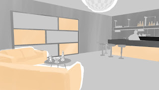
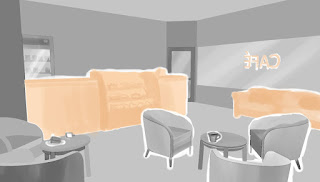
One of the things I did this week I've made digital prototypes of the four background images we have decided to be our first prio to have a functional game.
First I built up a base for the environment in Google sketch up and then imported a 2D image of it and painted on top of it. I did this to help decide on the colors and the shading. I did this because it is much easier to change and manipulate a digital image than a traditional one.
Above is the prototypes we decided on. Another thing we decided on was that some of the objects in the backgrounds is painted separately. An example is the lamp, potted plant and the coffee table in the living room (Image with the blue sofa.) When painted separately these objects can be animated to a certain degree. What we have in min is when you arrive at a location the base background appears. then the other objects sweep in from the sides. Kind of to mimic old school theater coulisses or assets. Why we want to do this is because we want to bring a little bit more life to the back round instead of just having static images.
About the colors. We decided that a specific area has their own accent color to help the player remember where the places were and where they met certain characters as their clothes will share the same accent color.
In the examples I have only the club and the café share accent colors. That is because orange is "Medborgarplatsen"'s accent color, so all the places in that area has orange accent. In the same way with the school. The corridor is yellow, the classroom would be yellow etc, and the characters appearing there will have yellow accent on their clothes.
Thats the sneakpeak for this week!
One of the things I did this week I've made digital prototypes of the four background images we have decided to be our first prio to have a functional game.
First I built up a base for the environment in Google sketch up and then imported a 2D image of it and painted on top of it. I did this to help decide on the colors and the shading. I did this because it is much easier to change and manipulate a digital image than a traditional one.
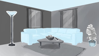
Above is the prototypes we decided on. Another thing we decided on was that some of the objects in the backgrounds is painted separately. An example is the lamp, potted plant and the coffee table in the living room (Image with the blue sofa.) When painted separately these objects can be animated to a certain degree. What we have in min is when you arrive at a location the base background appears. then the other objects sweep in from the sides. Kind of to mimic old school theater coulisses or assets. Why we want to do this is because we want to bring a little bit more life to the back round instead of just having static images.
About the colors. We decided that a specific area has their own accent color to help the player remember where the places were and where they met certain characters as their clothes will share the same accent color.
In the examples I have only the club and the café share accent colors. That is because orange is "Medborgarplatsen"'s accent color, so all the places in that area has orange accent. In the same way with the school. The corridor is yellow, the classroom would be yellow etc, and the characters appearing there will have yellow accent on their clothes.
Thats the sneakpeak for this week!
Subscribe to:
Posts (Atom)